Colors, architecture, people… Only by intensively experiencing a city can we grasp the entirety of its tastes and textures. A conversation with the designers of PURO Gdańsk’s unique interior - Regis De Salles and Simon Flint from DeSallesFlint* studio.
PURO Gdańsk: Deep breath of the city
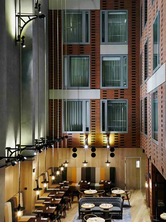
PURO: You design hospitality places and hotels around the world. What was unique in designing PURO Gdańsk interior?
DeSallesFlint: Firstly, the Puro hotel concept. Their fresh approach to hospitality and incredible focus towards customer service is truly inspiring. Secondly, the city of Gdansk itself and mostly the location of the hotel on the Granary Island. These were a great source of inspiration for many aspects of the interiors of the hotel.
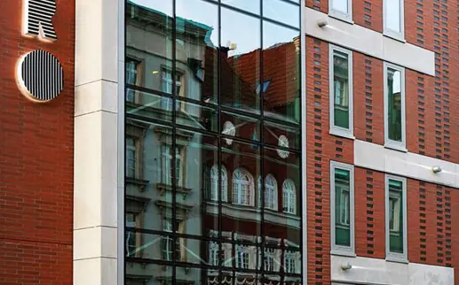
What was the main inspiration? Historical surroundings, local materials?
I would say the city of Gdansk as a whole. From the architecture of the city, the heritage of the Granary Island, the vibe of the city and of course the people.
All this together and much more, provided us with a very rich source of ideas and inspiration. The difficulty was to filter it all down and bring it into the design without theming the hotel. DeSallesFlint feels that is very important that the guests have a sense of place as they experience staying at the hotel or even when just visiting the hotel.
How did the research process look like? From which point did you start?
From taking a deep breath and trying to connect with the city. Inhaling everything through all your senses. Taking millions of photographs and literary immersing ourselves in the city. That’s the only way to truly discover and get inspired.
What materials and colors do you use in the project and why?
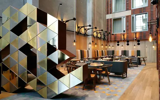
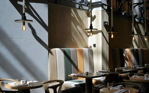
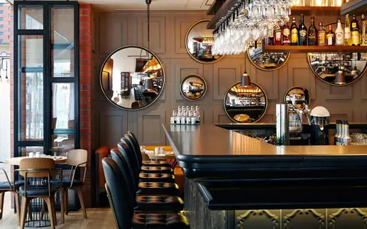
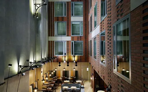
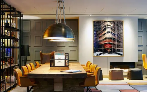
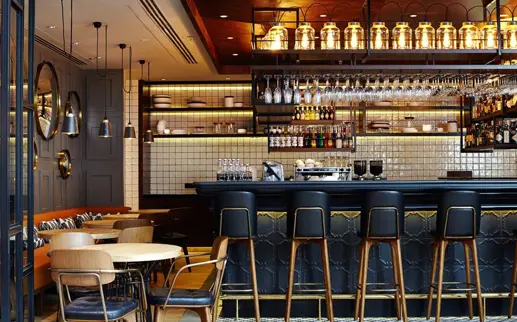
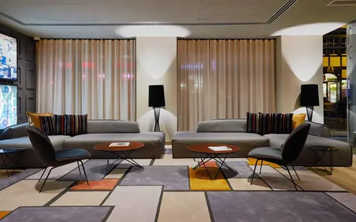
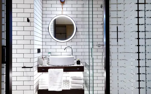
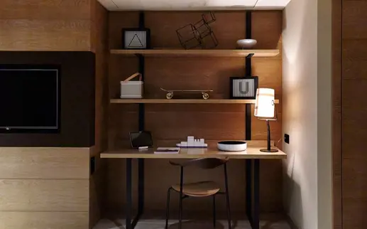
The Granary Island was our first port of call. So back in the day, thinking about all the Granary warehouse on full steam, our thoughts were: cranes, pulley’s… hence ideas for the light fittings in the Atrium. Sacks of grains: hence ideas for textiles. Natural fibres such as cotton, wool, linen and leather. The ideas for the hard finishes came from the warehouses themselves such as the timber and the steel metal!
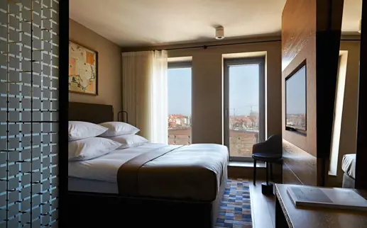
For the colours it was all about the Old City and Granary Island as well as the rest of the city, mixed all together. The obvious black and terracotta, but also the colourful and vibrant colours of the buildings in the old city. The colour palate for this project is a true reflexion of how our senses absorbed Gdansk itself.
Any interesting story about the project?
We have been very lucky on this project. All in all, it has been a very smooth process with very minor hick ups. Perhaps looking back, the lift bridges were a bit controversial! The lift bridges were not part of the original design. We came up with the idea of implementing the bridges as a viewing gallery, being much more daring. We wanted these bridges to go right across to the concrete wall, but there was much resistance. In the end (after much debate) the bridges were kept, but much smaller! :)
Similiar Articles
- News
- Gdańsk
Shakespeare in the heart of Tricity
- News
- Gdańsk
Retro Walks. The city and its ghosts
- News
- Gdańsk
